


There is a growing chorus calling today’s AI surge the next dot-com bubble. Even well-known voices like Michael Burry, who predicted the 2008 housing crisis, have drawn the comparison. It sounds convincing at first, but the comparison breaks down quickly. And for long-term investors, understanding the difference is critical.
Here is the simple truth. This is not another 1999. The foundations are different. The companies are stronger. The sentiment is almost the opposite. If we misunderstand the environment, we risk reacting emotionally rather than investing with discipline and clarity.
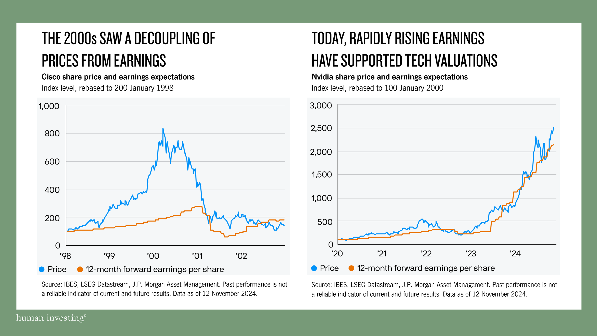
FIRST, Valuations Then Were Built on Hope. Today They’re Built on Earnings
During the dot-com era, prices surged with little connection to actual business performance. Cisco is the clearest example. The stock price raced higher while projected earnings stayed relatively flat. That disconnect is one of the clearest signs of a bubble. Investors were buying possibility instead of profitability.
Now look at today’s AI leader, Nvidia. Its stock price has risen but so have its forward earnings per share. Revenue is expanding. Demand is accelerating. Profitability is growing at a historic pace. The price is being pulled higher by fundamentals, not by wishful thinking.
This distinction matters.
In the dot-com era, prices broke away from earnings.
In the AI cycle, prices and earnings rise together.
For long-term investors, this is not a minor detail. It is the difference between speculation and substance. When prices run ahead of earnings, gravity eventually pulls them back. The two lines always reconnect. Prices can sprint or stumble in the short term, but fundamentals set the pace over time. When prices rise because earnings rise, it is the fundamentals doing the work.
NEXT, The Nature of the Companies Is Entirely Different
The second difference is straightforward. The companies simply are not comparable.
During the dot-com era, a clever idea and a domain name were often enough to attract enormous capital. Pets.com is the classic example. It raised over $82 million during its IPO despite having no profits and no evidence that its model worked. It became famous before it became viable. Nine months later, Pets.com closed their virtual doors.
Now compare that with today.
The AI landscape today is nothing like that. The Magnificent Seven leading AI investment are among the most profitable companies ever created. Apple, Microsoft, Alphabet, Amazon, Meta, Nvidia, and Tesla operate with financial strength that rivals entire industries. Together they have acquired more than 846 companies. Their revenue is diversified. Their moats are wide. Their infrastructure spans the globe. Their cash flow is massive.
This difference is not trivial.
Startups with untested ideas tend to burn cash, chase growth at any cost, and rely on investor optimism to stay alive. Established multi-trillion-dollar companies generate consistent profits, fund their own innovation, and can withstand economic shocks. They behave very differently.
The risks, opportunities, and outcomes are not comparable.
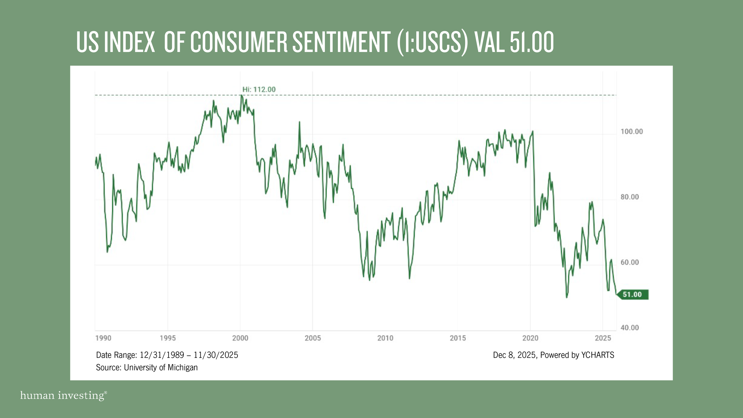
FINALLY, Sentiment Today Is Cautious, Not Euphoric
The most important difference may be psychological.
In the late 1990s, consumer sentiment reached historic highs. The University of Michigan index moved above 110. Confidence was overflowing. People believed prosperity would continue indefinitely. Alan Greenspan described the mood as irrational exuberance, and even that felt modest.
A 1999 Time magazine article reported workers quitting stable jobs to day-trade technology stocks. One story described a plumber who refused to fix a leaking pipe because he was too busy trading. That was the climate. Excitement replaced caution. Greed replaced discipline.
Today tells a different story
Consumer sentiment recently sat near 51, weaker than readings during the 2008 financial crisis. It reflects fear and uncertainty, not optimism. In hundreds of conversations advising investors during this season, not one person has pushed to increase equity exposure because of excitement about AI. Most express caution, not confidence.
This matters. Investor psychology often explains more about cycles than spreadsheets do.
Bubbles form when confidence outruns reality. Today, reality is outrunning confidence.
What we see today is not exuberance. It is skepticism.
What Investors Should Take Away
None of this means AI is risk-free. Markets never are. Technologies evolve. Leaders change. Expectations adjust. Some companies will thrive and others will fade. That is the natural rhythm of progress.
Some believe AI will reshape entire industries. Others expect only incremental change. No one knows for sure, and investors do not need perfect foresight to succeed. What they need is discipline, patience, and a strategy that holds up across many possible futures.
Periods like this tend to reward investors who rely on a thoughtful financial plan and avoid emotional decision making. Resiliency matters more than reaction.
At Human Investing, we help clients make clear, confident decisions in moments like this. We separate signal from noise. We keep your strategy rooted in your goals, not the market’s mood.
The biggest mistakes rarely come from missing a prediction. They come from acting too quickly. Our role is to walk with you through uncertainty and ensure your plan remains strong, thoughtful, and centered on what matters most to you.

Sources:
https://www.nytimes.com/2000/11/08/business/technology-petscom-sock-puppet-s-home-will-close.html
https://time.com/archive/6736122/day-trading-its-a-brutal-world/
Disclosure: This commentary is for informational purposes only and should not be considered investment, tax, or legal advice. The views expressed are based on current market conditions and are subject to change without notice. Past performance is not indicative of future results, and no investment strategy can guarantee success or protect against loss. References to specific companies are for illustrative purposes only and do not constitute a recommendation to buy or sell any security. Investors should consult with a qualified financial professional before making any investment decisions. Human Investing is an SEC-registered investment adviser. Registration does not imply a certain level of skill or training.


